Background: The existing branding options
Pigeonhole Live is an audience interaction tool, with a suite of different interfaces used by different roles during events:
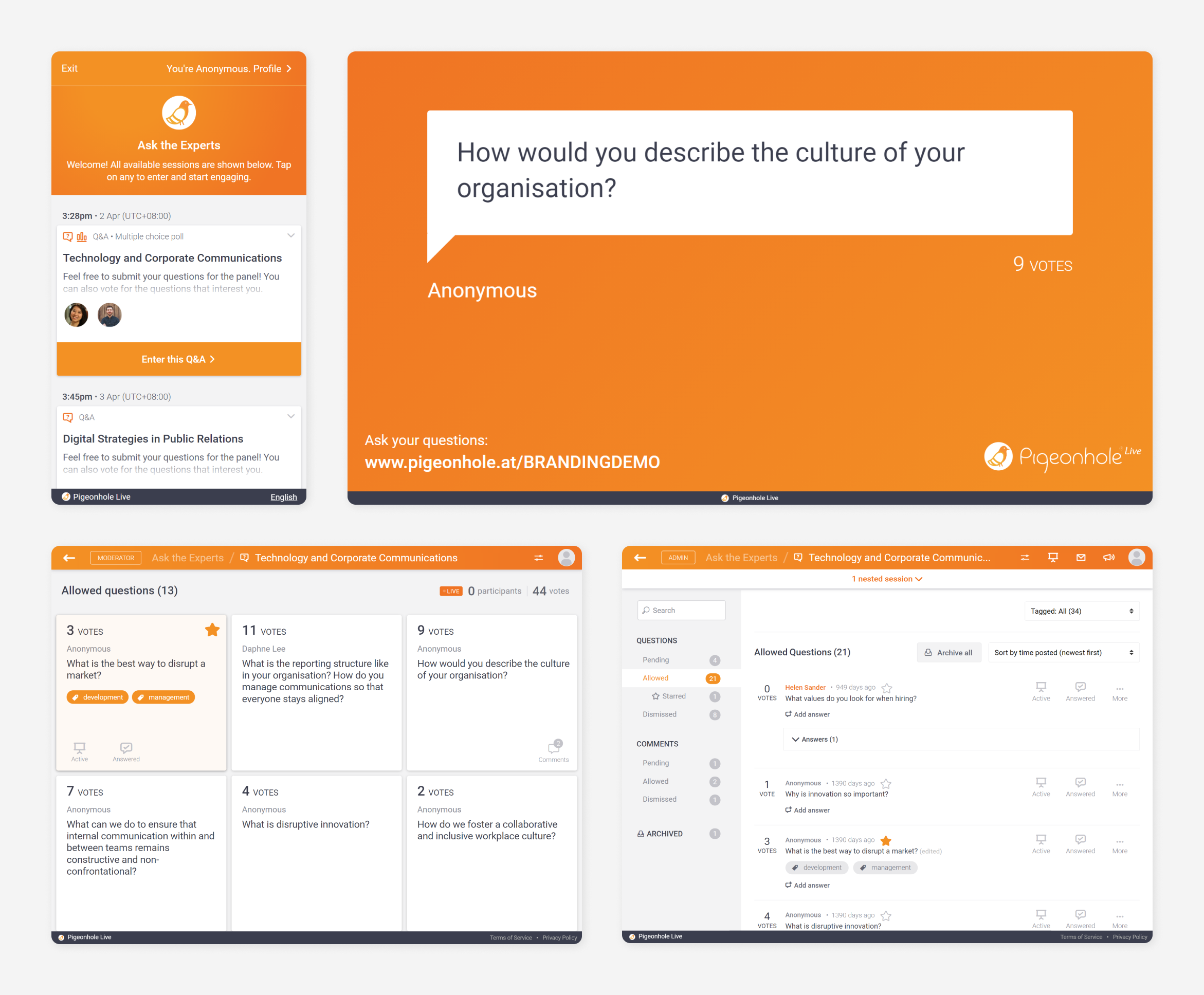
By default, the product is branded in Pigeonhole Live’s orange, but especially for larger or more formal events, organisers would like all the interfaces to match their event or company branding instead.
Prior to this project, there were two ways by which users could customise their branding:
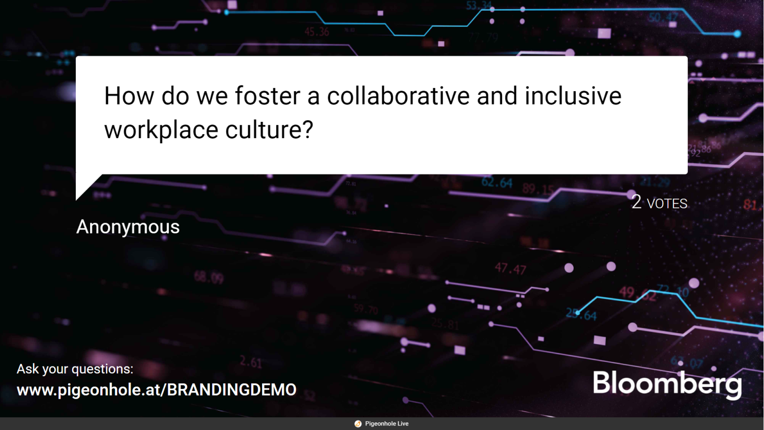
Logo Branding: Customers could upload their own logo, which would replace the Pigeonhole Live logo on the Projector Panel. While the colours were more muted, the UI highlights were still in orange.
Custom Branding: We could skin all the interfaces to match the client’s event branding. While this provided a much more complete branding solution, this option was less convenient for users as it could only be done on a per-request basis, and was not available as a self-serve feature. Due to the customised nature of implementation, we also charged a higher price for it.
The problem and objective
Each of the existing offerings had their limitations - Logo Branding did not offer a sufficiently complete branding solution, while Custom Branding was inconvenient and expensive. So there existed a large middle-ground between these two offerings that users were looking for - a self-serve and moderately-priced option to customise the Pigeonhole Live interfaces to fit their event branding.
From the business perspective, the objective of this project was to be able to compete better with our biggest competitors, Slido and Mentimeter, as they offered certain theming capabilities while we didn’t.
Calibrating the feature offering
One important consideration when building the theming feature was how to calibrate what degree of branding to offer at which price point, as we didn’t want to make our Custom Branding offering redundant, nor let our existing Custom Branding customers feel short-changed if we were to now offer full branding customisation for a much lower price.
The business team didn’t have a fixed requirement for this at the start, so I was given some freedom to explore and present some of the possibilities, and to work with them to determine the final Themes offering. This included considering which interfaces to theme, how to offer themes together with Logo Branding, and what styles of themes to offer.
Competitive research and initial ideas
I started by consolidating everything that I knew about the project in a working document - the objectives, notes and screenshots of competitive analysis and any ideas that came to me.
Since the business objective was to keep up with the competition, I did some competitive research, looking at a number of different products that featured some sort of theming for inspiration, and in particular noting down the following points regarding our closest competitors’ theming features:
- What they offered at different price points
- Which interfaces their themes applied to
- The degree of customisation that each of them offered
- Styles of themes offered and
- How their theme setup UIUX worked
I also wrote down my initial ideas on possible approaches, how this feature could be offered with respect to related features, and scoped how adjacent parts of the product might be affected.
Concept evolution of the setup UI
This was followed by rounds of design and internal reviews. I worked on concepts, created mockups and prototypes in Sketch and Invision, and reviewed them with our internal stakeholders and teams - critique with the design team, consultations with the engineers on implementation, reviews with our CEO and de-facto PM, and with the business team, who would look at it not only from the business perspective, but were also our closest connection with our users and could provide feedback from their perspective as well.
The starting point and scope
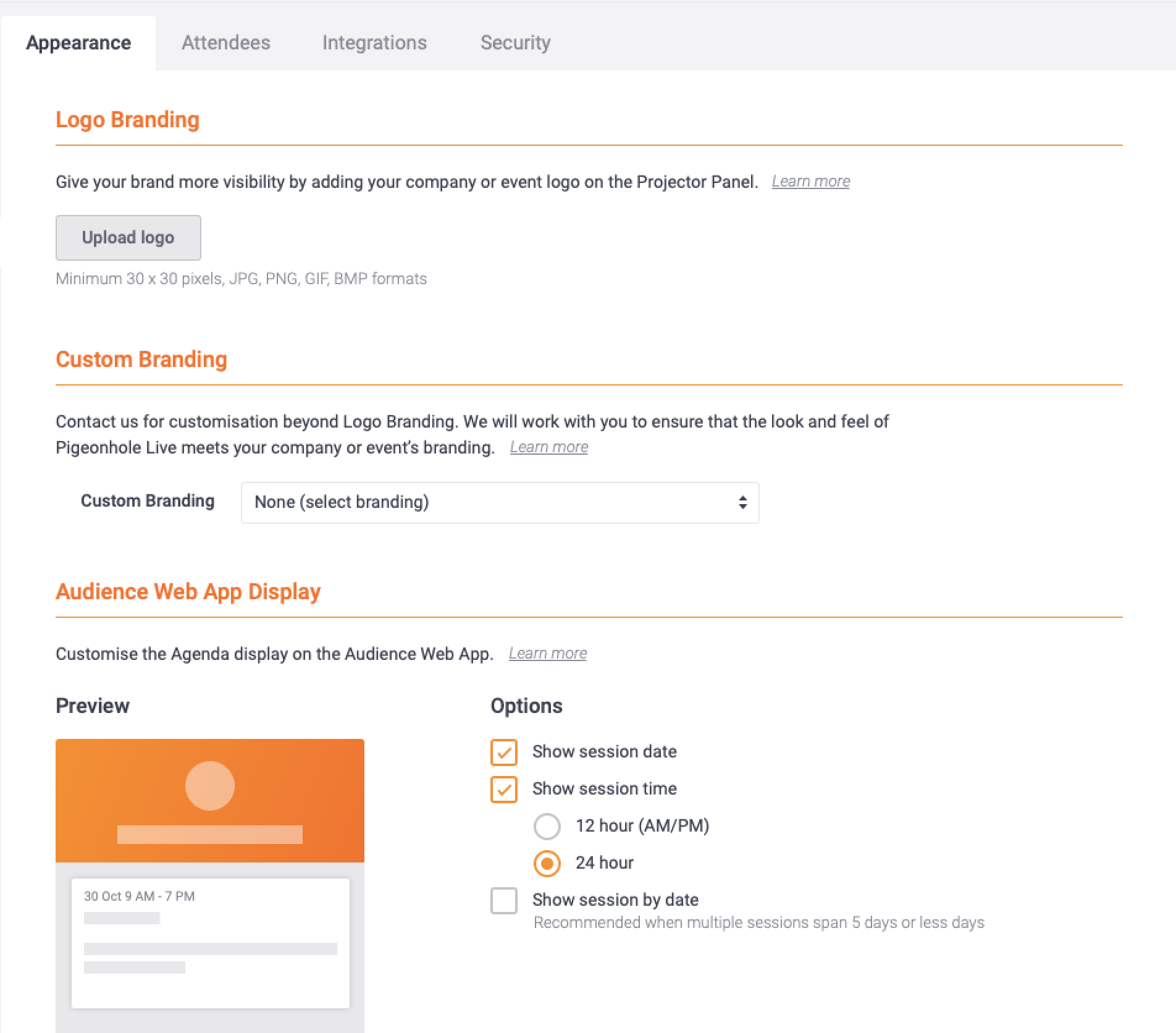
There was already an existing page dedicated to appearance setup, so it was straightforward to determine that the Themes setup should be added to this page.
Concept: Combining Themes and Logo Branding
Early on, we explored an approach where only the Projector Panel would be themed, while the audience interface would not be. This was one possibility of a middle-ground feature offering.
If we were to do this, in terms of the design of the setup flow, we could group the configuration options by interface - since Logo Branding was also limited to the Projector Panel, they could be previewed in the same section, while another section was dedicated to non-branding-related customisations on the Audience Web App:

Concept: Theme gallery
Another area of exploration was the theme gallery display. I tried a layout featuring large images for each theme, which could serve as previews and selection options at the same time, but I soon decided to use smaller thumbnails instead, as that would allow for a larger number of themes to be displayed in less space.
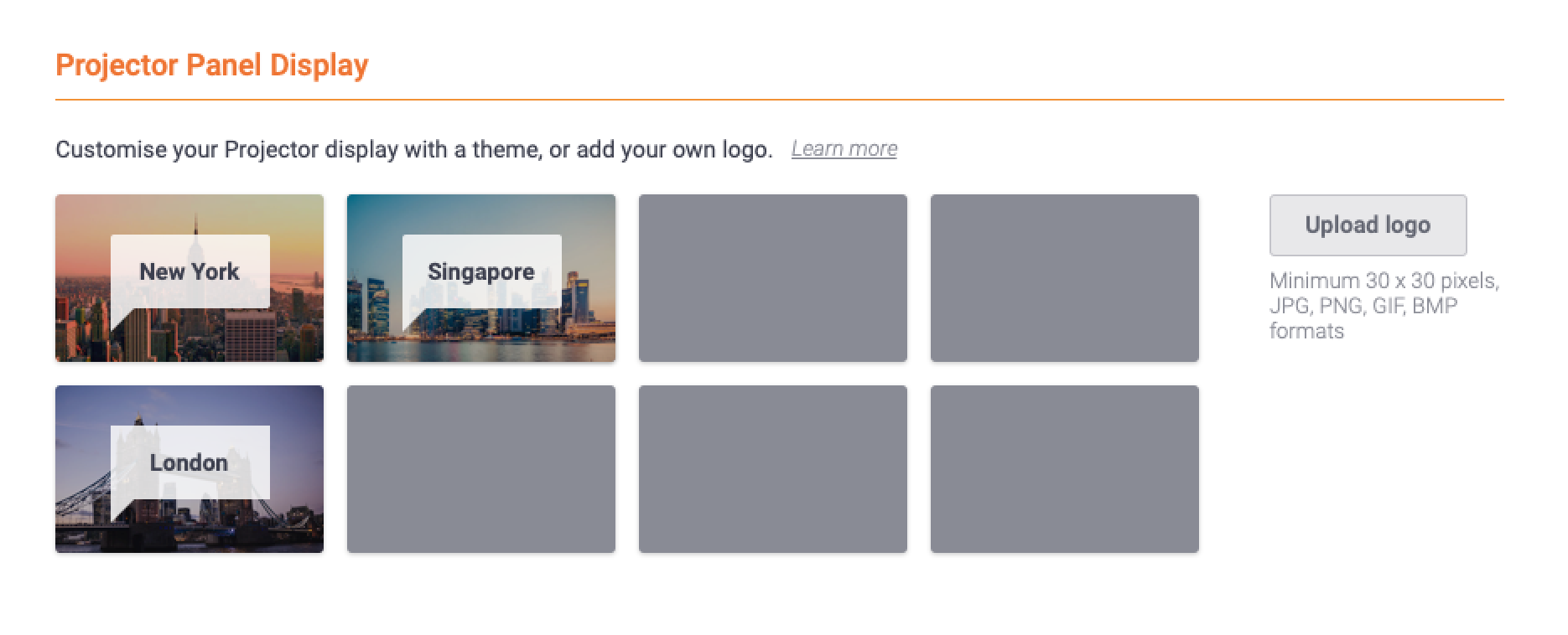
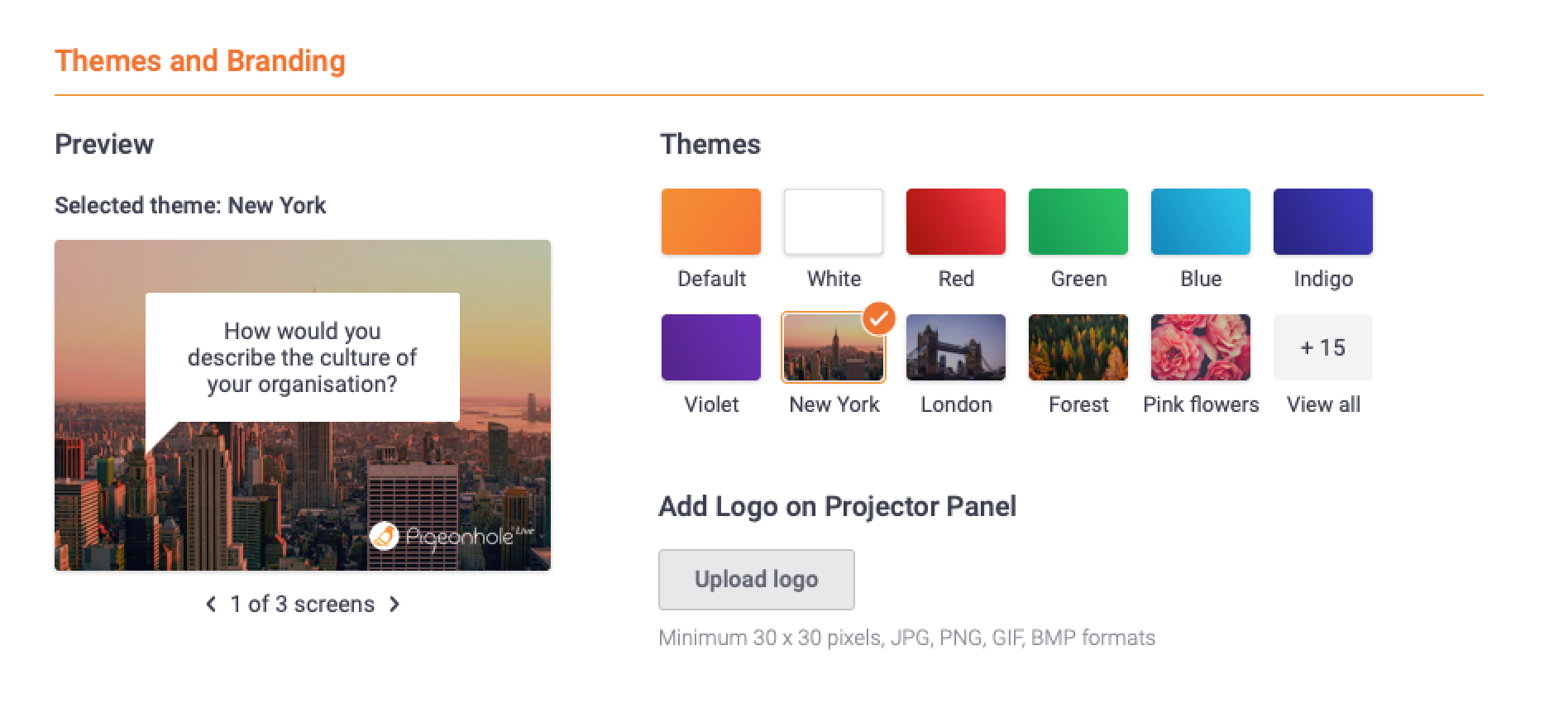
I also decided to include names for each thumbnail to provide a hint of what each theme was. This would make it easier to scan the options and understand what types of themes were available at a glance.
Of course, a more detailed preview was still necessary, so I included a larger preview with 3 different screens as well.
Final Themes feature concept
We eventually settled on theming all the interfaces, rather than just the Projector Panel. The reason was that it would be beneficial both to the users (users would enjoy a more complete branding solution) and easier from a technical implementation standpoint, while still providing a good middle-ground offering, as there were still limitations in that users wouldn’t be able to choose their own specific colours or use their own images.
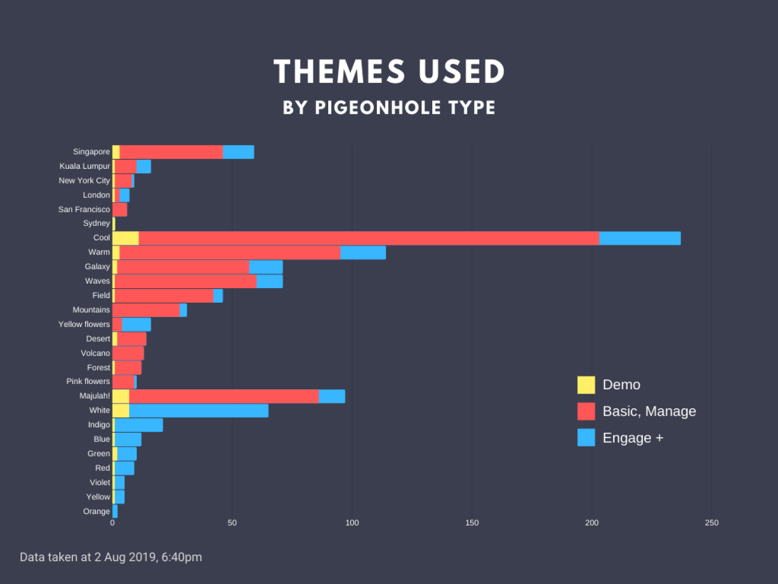
Secondly, a decision was made to offer the solid colour themes at a higher price point because it was hypothesised that solid colour themes, despite being visually simpler, were actually more valuable for branding purposes than themes with background images. The themes available for free would be city themes and nature themes, with the choice of cities based on our largest markets.
Final setup UI and flow
In the final design, all the Themes and branding options were grouped together - Themes, Logo Branding, and Custom Branding. In this way, users could consider everything related to branding together and understand how applying each type of branding would affect or work together with the others.
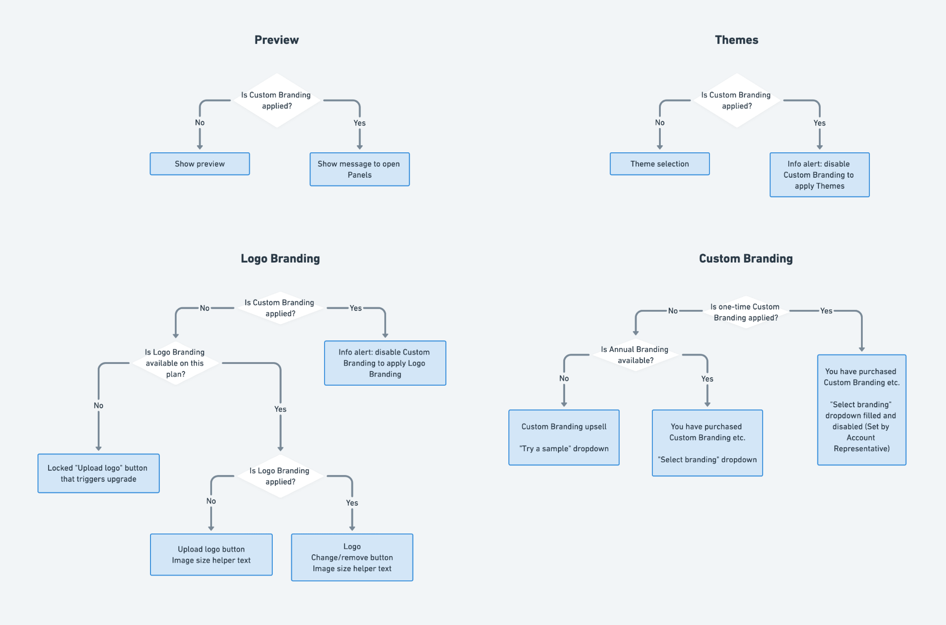
UI logic
As there were different states and factors that could affect what UI elements each user would see, I created a set of flowcharts to help myself ensure that I had covered all the cases, and to communicate the logic to the engineers.
Creating the themes, development and testing
While the feature was in development, I worked on creating the 27 themes, including:
- Sourcing for royalty-free images
- Editing them to ensure that our UI elements could be seen on the theme, and
- Generating the themes using our internal skin generator tool
I was also responsible for doing QA to ensure that everything was developed to spec, and providing graphics for our product marketing update upon release.
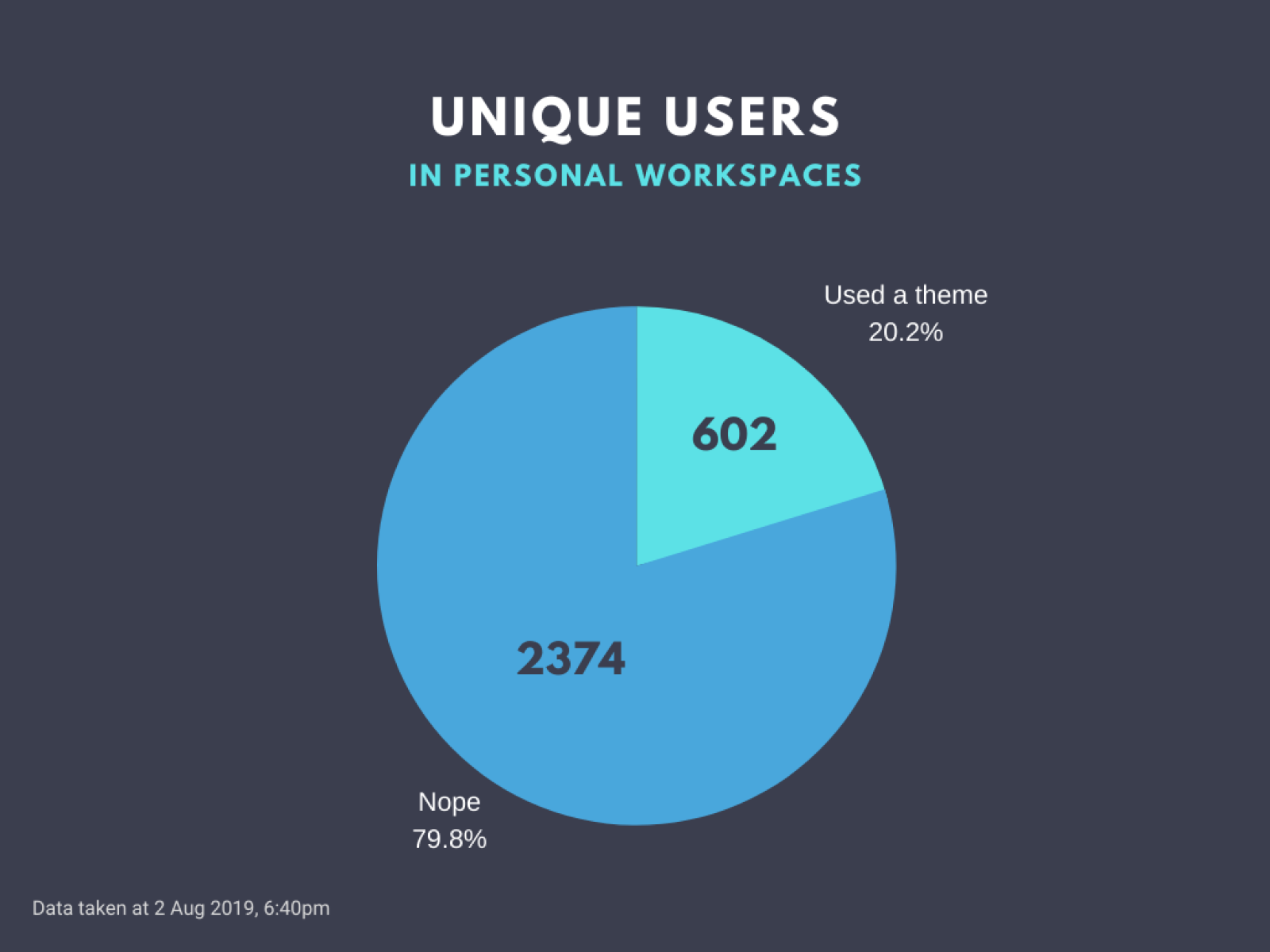
Post-release usage review
About a month after the release, I shared a presentation reviewing how the feature was being used. My aim was to initiate a greater interest in data and metrics to encourage the company to become more data driven, so I started by setting an example and presenting a feature data review on Themes during our all-hands meeting.
In preparation, I shared the kind of data and comparisons I wanted to find out about with one of our engineers, who then helped to create a dashboard based on data from our database. After doing some additional data processing, I put together a presentation for the team.
All artwork is property of PigeonLab Pte. Ltd.
